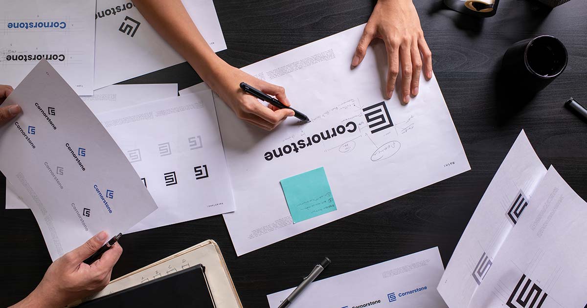
You have your logo. Your colors are defined. Your fonts are chosen. Your brand guide is ready. Now comes the moment where all these elements come together to form a cohesive visual language—the Graphic Brand Line.
The graphic brand line is the visual system that defines how your identity elements interact, combine, and adapt across every application. It’s what makes your brand instantly recognizable, whether on a business card, a billboard, or a social media post.
In this article, I explain what a graphic brand line is, why it matters, how to build one, and—importantly—how it evolves over time.
📌 What Is a Graphic Brand Line?
A graphic brand line is the visual language that connects all your brand elements into a cohesive system. It’s not a single element—it’s the set of rules and patterns that determine how your logo, colors, typography, and imagery work together.
Think of it as the grammar of your visual identity. Just as grammar defines how words combine to form coherent sentences, the graphic brand line defines how visual elements combine to form coherent communications.
💡 Your brand guide defines the ingredients. Your graphic brand line defines the recipe.
🧾 Why You Need a Graphic Brand Line
A strong graphic brand line gives your business several advantages:
- Cohesion: All materials look like they come from the same brand
- Efficiency: Designers don’t start from scratch every time
- Flexibility: The system adapts to different formats and media
- Recognition: Consistent visual patterns build brand memory
- Scalability: New materials follow established patterns
💡 Without a graphic brand line, your brand is just a collection of elements. With it, it’s a language.
🔄 The Graphic Brand Line Is Not Static
One of the most important things to understand about your graphic brand line: it will change.
Your logo evolves. Your brand identity matures. Your graphic brand line adapts to the moment. All of these elements are designed to evolve with your business, with the market, and with the times.
The graphic brand line adapts to:
- Seasonal campaigns: Holiday colors, summer patterns, year-end themes
- Trends: New illustration styles, contemporary layouts, emerging formats
- Rebranding: Major updates to visual language
- New product launches: Fresh treatments for new offerings
- Cultural moments: Events, celebrations, or causes your brand supports
- Platform evolution: New social media formats, website redesigns
💡 Your brand is a living thing. Your logo, identity, and graphic brand line all breathe, evolve, and stay current together.
Examples of Evolution
| Brand | Constant Core | Evolving Elements |
|---|---|---|
| Simplicity and playful spirit | Logo refinements, Doodles, seasonal treatments | |
| Spotify | Green and black core | Campaign visuals, playlist covers, artist branding |
| Nike | The Swoosh and movement | Campaign photography, typography, seasonal patterns |
| Coca-Cola | Script logo and red | Holiday campaigns, packaging, cultural moments |
💡 A brand that doesn’t evolve feels outdated. A brand that evolves thoughtfully feels alive, relevant, and current—while remaining unmistakably itself.
📋 The Elements of a Graphic Brand Line
1. Iconography
Iconography is the system of symbols, icons, and pictograms that support your brand communication. Consistent icons help users navigate, understand information, and recognize your brand at a glance.
What to define:
- Icon style: Linear, filled, outlined, hand-drawn, isometric
- Line weight: Thickness of lines (consistent across all icons)
- Corner style: Rounded, squared, or mixed
- Size: Standard sizes for different applications
- Color usage: Primary colors, secondary colors, or single color
- Consistency rules: When to use filled vs. outlined, color vs. monochrome
💡 Icons should feel like they belong together. A consistent style creates visual harmony.
2. Graphic Elements and Patterns
Beyond logos and icons, your brand needs supporting graphic elements—shapes, lines, textures, patterns—that create visual interest and reinforce your identity.
What to define:
- Primary shapes: Circles, squares, lines, organic forms
- Patterns: Repeating elements, textures, backgrounds
- Borders and frames: How to frame content
- Accent elements: Splashes, dots, highlights
- Seasonal adaptations: How these elements change for holidays, seasons, or campaigns
💡 Graphic elements should enhance, not overwhelm. They’re the seasoning, not the main dish.
3. Composition and Layout
How elements are arranged on a page or screen is just as important as the elements themselves.
What to define:
- Grid system: Columns, margins, alignment rules
- Hierarchy: How to emphasize important information
- Spacing: Consistent margins, padding, and white space
- Balance: Symmetrical vs. asymmetrical compositions
- Flow: How the eye moves across the composition
💡 Consistent layout patterns make your materials feel familiar and professional.
4. Photography and Imagery Treatment
If your brand uses photography, define how images should look and feel.
What to define:
- Subject matter: Types of people, places, objects that fit your brand
- Color treatment: Filters, saturation, mood
- Cropping: How images are framed
- Composition: Portrait vs. landscape, close-up vs. wide
- Seasonal variations: How imagery adapts for different seasons or campaigns
💡 A consistent photographic style is as recognizable as a logo.
5. Typography in Context
Beyond choosing fonts, define how they’re used in different contexts.
What to define:
- Headline treatment: Size, weight, spacing, case
- Body text treatment: Size, line height, paragraph spacing
- Hierarchy: H1, H2, H3, body, caption, small print
- Color application: When to use brand colors vs. neutral colors
- Special treatments: Pull quotes, callouts, highlights
💡 Typography should guide the reader and reinforce hierarchy without calling attention to itself.
📊 How the Graphic Brand Line Applies Across Media
Iconography
Icons appear across all materials. They should be consistent in style, weight, and color.
- Website: Navigation icons, feature icons, social media icons
- Social media: Story icons, post decorations, highlight covers
- Print: Infographics, diagrams, decorative elements
- Presentations: Bullet point icons, section dividers
Advertising
Advertising requires the graphic brand line to be flexible enough for different formats while remaining recognizable.
- Print ads: Hierarchy, image treatment, logo placement
- Digital banners: Adaptability to different sizes, clear call to action
- Billboards: Simplicity, readability at distance, impact
- Video ads: Motion, timing, transitions
💡 Your advertising should be instantly recognizable as yours, even without the logo.
Promotional Items (Merchandise)
Promotional items—pens, mugs, t-shirts, bags—are walking billboards for your brand.
- Apparel: Logo placement, size, color variations
- Stationery: Pens, notebooks, folders—consistent use of colors and patterns
- Drinkware: Scale, visibility, material considerations
- Technology: Power banks, USB drives—subtle vs. prominent branding
💡 Promotional items should be useful and desirable, with branding that enhances rather than overwhelms.
Stationery
Stationery is often the first physical touchpoint someone has with your brand.
- Business cards: Layout, logo size, color, paper stock, finish
- Letterhead: Header, footer, margins, placement of contact information
- Envelopes: Window placement, return address, logo
- Notebooks: Cover design, interior layout, binding
- Folders: Design, pockets, branding placement
💡 Quality stationery signals professionalism and attention to detail.
Content
Content—articles, guides, videos, infographics—requires consistent visual treatment.
- Blog posts: Header images, pull quotes, section breaks, author bios
- Guides and ebooks: Cover design, chapter headers, diagrams, footers
- Infographics: Data visualization style, icon usage, color coding
- Presentations: Slide templates, transitions, speaker notes
💡 Content should be visually consistent so readers know they’re consuming your brand, even without the logo.
Social Media
Social media demands consistency across platforms and adaptability to different formats.
- Profile images: Logo, icon, or brand element that fits the circle/cropped format
- Cover images: Space for text, logo placement, adaptability to different devices
- Post templates: Consistent layout, colors, typography across all posts
- Story templates: Readable on mobile, quick to understand, brand elements
- Video thumbnails: Clickable, readable at small size, consistent style
💡 Your social media presence should be instantly recognizable, whether someone finds you on Instagram, LinkedIn, or Facebook.
Website
The website is often the central hub of your brand. The graphic brand line must translate to digital.
- Header and navigation: Logo placement, menu style, sticky behavior
- Homepage: Hero image, layout, content hierarchy, calls to action
- Interior pages: Consistent templates, sidebars, footers
- Mobile: Responsive behavior, touch targets, readability
- Interactive elements: Buttons, forms, hover states, animations
💡 Your website should feel like the home of your brand—cohesive, professional, and easy to navigate.
🛠️ How to Build Your Graphic Brand Line
Step 1: Start with Your Brand Guide
Your graphic brand line builds on the foundation of your brand guide. You already have your logo, color palette, typography, tone of voice, and imagery guidelines.
Step 2: Define Iconography
Create a consistent icon set that will be used across all materials. If possible, develop custom icons that reflect your brand’s personality.
Step 3: Establish Graphic Elements
Define supporting shapes, patterns, and decorative elements that can be used to add visual interest. Include guidelines for seasonal or campaign variations.
Step 4: Create Layout Templates
Develop templates for common formats:
- Business card
- Letterhead
- Social media posts (Instagram, Facebook, LinkedIn, Twitter)
- Blog post header
- Presentation slide
- Email newsletter
Step 5: Test Across Applications
Apply your graphic brand line to real materials. Test at different sizes, on different backgrounds, across different media.
Step 6: Document Everything
Create a section in your brand guide dedicated to the graphic brand line, with examples of correct application across all media. Include guidelines for how the graphic brand line can evolve for seasons, campaigns, and trends.
💡 The graphic brand line is a living system. It should evolve as your brand grows, but always from a consistent foundation.
📋 Graphic Brand Line Checklist
Before finalizing your graphic brand line, verify:
- ☐ Icon style defined and consistent
- ☐ Graphic elements and patterns established
- ☐ Seasonal or campaign variations considered
- ☐ Composition and layout rules documented
- ☐ Photography treatment defined
- ☐ Typography hierarchy in context
- ☐ Templates created for key applications
- ☐ Social media presence consistent
- ☐ Website design follows the system
- ☐ Stationery and promotional items aligned
- ☐ Advertising materials tested
- ☐ Evolution guidelines documented
📚 Useful Internal Links
- Corporate Identity: Who You Really Are
- Tone of Voice: The Personality of Your Brand
- Logo: The Face of Your Brand
- Brand Guide: The Rulebook for Your Visual Identity
- 4D Graphic Design Methodology
✅ Conclusion
The Graphic Brand Line is the visual system that transforms a collection of brand elements into a cohesive, recognizable language. It’s what makes your brand feel consistent across a business card, a billboard, a social media post, and a website.
But unlike static elements, your graphic brand line is meant to evolve. It adapts to seasons, trends, campaigns, and cultural moments. It keeps your brand feeling alive, relevant, and current—while always remaining unmistakably yours.
Remember:
- Icons must be consistent in style, weight, and color
- Graphic elements should enhance without overwhelming
- Composition and layout create familiarity
- Photography treatment defines mood
- Typography hierarchy guides the reader
- Every application should feel like it comes from the same brand
- Your graphic brand line breathes and evolves with the times
Your brand guide gives you the ingredients. Your graphic brand line teaches you how to cook. And the result is a brand that’s recognized, remembered, and trusted—everywhere it appears.
Build your graphic brand line. Let it evolve. Serve a brand that stays current.